
How A "Typo" Doubled Our ROAS (Part 2)
If you sell physical products with Facebook ads, try this next time you duplicate an ad.

Welcome to Part 2 of The Typo Ad Method.
(Part 1 is here if you missed it)
Lets jump right in…
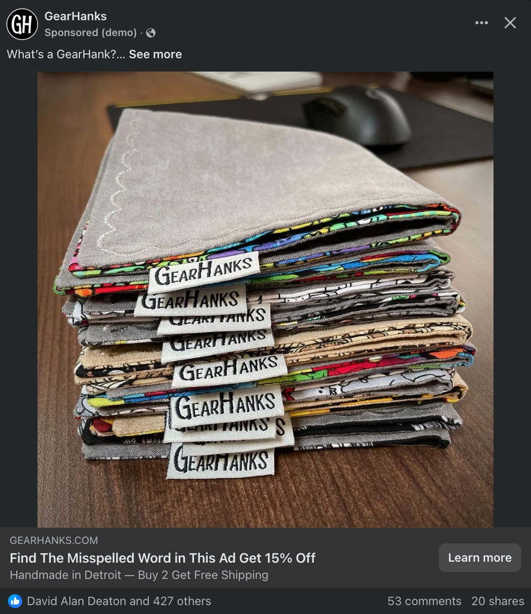
The screenshot below is the actual typo ad that generated $216K in sales for us.
This ad worked because it was engineered to involve people and quietly flip psychological switches as they scrolled.
Let’s break it down—exactly how it appeared in the Facebook newsfeed.
1. The Post Text: “What’s a GearHank?...”
This was the very first line of the ad.
At a glance, it just looks like a casual question. But this is where the magic starts—and it was intentional.
Why I used it:
I knew most people scrolling Facebook & Insta would have no idea what a GearHank is. Rather than start with a pitch, I led with a simple question to spark curiosity and open the door to explain the product.
It felt conversational, not promotional.
What it’s doing:
It opens a loop.
The ellipsis leaves the thought unfinished. That subtle tension pulls people in.It creates low-friction engagement.
I’m not selling—I’m starting a dialogue. That’s disarming.It primes the click.
“See More…” becomes a natural next step.
And once they click… They’re involved.
They’ve taken the first step, a micro commitment.
2. The Image: Stack of GearHanks
Next up, the product photo: a clean stack of colorful GearHanks, all tagged and neatly arranged. This wasn’t just a pretty picture—it was the result of testing.
I had tried standalone product shots before. Just one hank on a desk or in someone’s hand. They looked fine—but they didn’t convert as well. The stack (or some version of it) always won.
My theory?
I started to notice a pattern in the results. Whenever I featured just one hank—like a skull design—people who weren’t into that style would bounce.
But the stack? That hit different. Because I wasn’t telling people what to buy—I was inviting them to choose. The stack didn’t push a theme—it stirred curiosity. It let people browse with their eyes and mentally pick one they liked without pressure.
The variety said:
“Here’s a bunch of cool options. Pick the one that fits your style.”
That subtle shift made a difference.
What it’s doing:
It’s scroll-stopping.
The symmetry, the textures, the color contrast—it makes people pause, even if they don’t know why.
It’s building trust.
No models, no fluff, no fancy lifestyle shots. Just real product, presented clean.
It’s reinforcing the brand.
You see the GearHanks name 9 times in one image—without needing a logo.
The photo didn’t sell the product. It showed the collection—and made people want to find one they liked.
3. The Headline: “Find The Misspelled Word in This Ad Get 15% Off”
This was the line that changed everything. Tucked just below the image, it didn’t look like a traditional headline.
It wasn’t hype. It wasn’t emotional. It was a challenge. A puzzle for them to solve. And it stopped people cold.
Why it worked:
It flipped the script.
Most Facebook ads tell you what to do:
“Get 15% Off Today!”
“Shop Now!”
This one made them earn it.
It triggered curiosity and involvement.
Instead of passively reading, people interacted. They scrolled back up. Tapped “See more” Reread the copy. They played along—and that was the point.
It created a mini dopamine loop.
When they found the typo, they got a hit of satisfaction. And when they entered the correct spelling at checkout and the discount kicked in? That felt like a reward, not a promo.
It wasn’t some gimmicky “spin-the-wheel” pop-up. Those are flashy but shallow—you click, spin, get a code you didn’t earn, and forget about it five seconds later.
This was different.
The reader had to engage. They had to notice. They had to win. That emotional investment made the discount feel personal—and the product feel more valuable.
It filtered the right kind of buyers.
The headline didn’t bait casual scrollers—it invited curious, thoughtful people to take action. And those are exactly the kind of people most likely to buy.
But here’s what most media buyers still miss:
This headline didn’t just filter buyers—it trained the algorithm.
We kept the targeting broad. No stacked interests. No fancy lookalikes.
Because the copy itself was doing the sorting.
Facebook’s algo doesn’t just optimize based on who people are—it watches how they behave. And behavior like stopping, reading, solving, and clicking?
That’s gold.
This kind of copy sends a clear signal to the algorithm:
“Hey Facebook, show this to people who read ads, solve puzzles, and actually buy stuff.”
That’s the magic of broad targeting today:
The right copy doesn’t just convert buyers—it helps the algorithm find them in the first place.
4. The Post Text:
This is where the real persuasion kicks in…
After seeing the image and headline, most people scroll back up and click “See more.” Now they’re fully involved—and the copy gets to work.
This wasn’t random. It was layered with intent. Every line had a job.
Let’s break down what the copy actually did—and how it quietly built trust, framed the offer, hid the typo, and closed the sale.
The Opener:
“Think of a GearHank as a modern-day spin on Grandpa’s handkerchief… with one exception. We don’t recommend blowing your nose in a GearHank. They’re too nice for that!”
Why it works…
Anchoring to Familiarity: I was taking something unfamiliar (GearHank) and immediately connecting it to something universally recognized:
—Grandpa’s handkerchief.
That’s conceptual anchoring.
You should always frame the product in a way the brain already understands.
Pattern Interrupt + Personality: Instead of hyping features or dropping a benefit right away, I told a joke.
“We don’t recommend blowing your nose in a GearHank… they’re too nice for that!”
That line of copy was unexpected enough to interrupt the scroll and spark a smirk.
Charm and humor lower resistance—and keep the scroll going.
Frames Product as Elevated: Calling it “too nice” to blow your nose in sets the tone for premium positioning—without actually saying the word “premium.” It nudges the product out of utility-only territory and into gear worth caring about.
The Persuasion Stack:
“Here’s why you want one…”
This line flips the frame. It doesn’t say “Here’s what it does.” It says you want this—right now.
That’s a classic presupposition in NLP. It assumes desire is already there. The reader’s subconscious fills in the gap: “Wait… why do I want one?”
Now they’re reading to justify a feeling—not just evaluate a product.
“Aside from the cool patterns, the main reason people buy GearHanks is because they care about keeping their gear clean and protected.”
Here’s where the persuasion stack kicks in:
1. Embedded Social Proof
“The main reason people buy…”
That’s soft suggestion. We’re not yelling “Best Seller!”—we're framing it like an observed behavior. It signals: Others are already doing this. Readers subconsciously align themselves with “people who buy smart, useful stuff.”
2. Identity-Level Framing
“…because they care about keeping their gear clean and protected.”
That line mirrors the reader’s values. It’s not about the microfiber cloth—it’s about being someone who cares about quality gear. That’s an identity buyers feel good stepping into.
3. Value Anchoring
Then we stacked it with high-ticket, daily-carry items:
…phones, tablets, watches, knives, jewelry
These aren’t random. They’re anchors—they frame GearHanks as protection for things that matter. Now $25 feels more like an investment than an impulse buy. This one paragraph hits desire, social alignment, identity, and value in under 30 words.
It’s not just explaining the product—it’s shaping how the reader sees themselves with it.
4. Future Pacing + Friction Removal
And just when they’re leaning in…
I lowered the friction even more—by showing them how easy it is to carry.
“When you are done using your hank, it will fold up nicely in your pocket (or purse) without any bulk.”
Why it works:
This line doesn’t just explain a feature—it uses future pacing, a classic NLP technique.
I’m walking the reader into a post-purchase moment:
They’ve already used it.
They’re folding it.
They’re putting it away.
It’s subtle, but powerful.
I’m letting them mentally rehearse ownership—and when the brain imagines a future action, it starts aligning to make it real.
That’s not just persuasion. That’s pre-suasion.
And most people don’t even realize it’s happening. But if you’ve studied NLP or deep behavioral response marketing, you’ve seen this trick before. I’m not telling them to buy. I’m showing them what life looks like once they already have.
5. Trust. Craftsmanship. Scarcity.
“Each hank is handmade here in Detroit, Michigan with the highest level of craftsmanship.”
This line builds authenticity and local credibility in one move. We’re not dropshipping. We’re making these by hand. Handmade = care. Detroit = real.
“Because we make our hanks in small batches, some designs will never be repeated. So chances are you’ll have a one-of-a-kind GearHank.”
That’s built-in scarcity—without the hype. I’m not shouting “LIMITED TIME ONLY!” I’m calmly telling them this might be their only shot. It creates gentle FOMO while increasing perceived exclusivity.
This next chunk of copy grounds the offer. It proves the product exists.
Here are the specs:
9”x9” - 100% pre-washed cotton front - Ultra-soft sueded microfiber back - Finished with color-coordinated decorative stitching
Now they’re shifting from emotion to logic—giving the rational brain something to latch onto while the emotional brain is already sold.
That’s classic copy flow: Emotion → Justification.
“Choose a design you like and we will ship it right out.”
This is soft urgency.
No pressure. No countdown clock. Just a confident, friction-free nudge to act now.
6. Trust. Reassurance. Trigger.
“Your satisfaction is gauranteed!”
At a glance, this is a classic risk-reversal line. But if you’ve been following closely—you know this is also where the trap is set. That one word “gauranteed” is misspelled on purpose.
The typo is baked into the most trust-building line in the entire ad.
Here’s why that’s genius:
The reader’s guard is down. They’re skimming the end.
The typo blends in naturally. It doesn’t feel forced or gimmicky.
It doesn’t confuse the message. The guarantee still lands. It still reassures.
This is the involvement device in disguise. If they miss it, the P.S. at the end invites them to go hunting. Either way? They’re interacting.
And right after that moment of engagement, I lower the risk…
“If for some reason you don’t like your GearHank just send it back within 30 days for a prompt and courteous refund.”
This is a classic risk reversal. Simple, confident, and low-friction.
It tells the buyer: “You’re not trapped. You’re protected.”
And that makes clicking through feel like less of a leap.
https://GearHanks.com/collections/all-hanks
Thank you for your support!
— James & Brenda from Detroit, MI
This outro reinforces everything we’ve built:
A real product
Run by real people
Sold with sincerity
It’s personal. Local. Human.
And it leaves the reader with a vibe—not a pitch.
This section doesn’t shout, it whispers reassurance—and hides the smartest trigger in the ad.
7. Curiosity. Control. Conversion.
“P.S. Would you like a 15% discount?”
It looks like a polite afterthought—but it’s actually a strategic reactivation device. That soft yes/no question pulls the reader back in with a mini micro-commitment. No urgency. No pressure. Just a moment of control.
And since it comes right after the guarantee, the reader feels safe. They’re leaning in.
Now it’s time to make them feel clever—by earning their reward:
“In this ad you will find one misspelled word. Go ahead and type the misspelled word CORRECTLY in the ‘Discount Code’ box on the checkout page. 15% will be instantly subtracted from your total.”
Here’s what this one line actually does:
Triggers closure (Zeigarnik Effect)
Creates a mental reward loop
Hands control to the buyer (they’re not given the discount—they unlock it)
Gamifies the CTA without feeling like a gimmick
Reinforces involvement one last time before purchase
It turns a boring coupon code into a tiny game—and the second they play, they convert themselves.
The P.S. should never be filler. It’s the final, strategic nudge. The last hook that turns curiosity into clicks—and clicks into conversions.
How to Use the Typo Ad Method™ In Your Own Ads
Alright, now that you’ve seen how this simple tactic nearly doubled ROAS and drove $216,000+ in sales for a $25 product…
Let’s talk implementation.
Because while this exact ad worked for my physical product, the Typo Ad Method™ isn’t just for eCom.
It works because it taps into universal persuasion triggers—ones that work in any vertical:
Curiosity
Challenge
Involvement
Reward
This isn’t about misspelling a word randomly. It’s about engineering a micro-challenge that engages the brain and subtly qualifies your ideal buyer.
Let’s break it down.
The Core Ingredients
Every successful “typo ad” follows the same psychological blueprint.
Here’s what to include:
1. The Involvement Device
Use a typo, hidden word, riddle, or visual oddity to create an open loop. The goal is to interrupt the scroll with curiosity that demands resolution.
2. The Reward Mechanism
This could be a discount, bonus, or early access—but the reward must feel earned. That sense of accomplishment triggers ownership and commitment.
3. Clear Instructions
Tell them exactly what to do. Simple and specific: “Find the misspelled word and type it into the checkout box.”
4. A Natural Fit
The copy should feel native to your brand and tone. Don’t wedge in a gimmick—engineer a challenge that feels fun, clever, and aligned.
Plug & Play AI Prompts
Here are some ready-to-use ChatGPT prompts that let you brainstorm and customize Typo Ad angles—no matter what you sell:
Prompt #1:
“Write a Facebook ad that includes a deliberate typo and invites readers to find it in exchange for a reward. The product is a [describe your offer]. The tone is [playful/professional/edgy].”
Prompt #2:
“Create a curiosity-driven ad using the Zeigarnik Effect/Open loop. Make the reader stop, re-read, and engage by solving a hidden challenge or spotting a mistake.”
Prompt #3:
“Take this headline and rewrite it with a typo that subtly grabs attention without being obvious: [insert your original headline].”
Prompt #4:
“Write a 3-step call-to-action that rewards the reader for finding a deliberate error in the ad and using it to unlock a bonus.”
Real-World Use Cases (that aren’t eCommerce)
→ Coaches / Consultants
“Spot the typo in this post. Mention it during our strategy call and I’ll waive your onboarding fee.”
→ SaaS / Memberships
“There’s a typo in this ad. Enter the corrected word on our signup page for a secret 7-day extension on your trial.”
→ Lead Generation Funnels
“I left a misspelled word in this post. DM me the correction and I’ll send you a bonus training instantly.”
→ Digital Info Products
“One word is off in this ad. Find it, and I’ll give you access to a hidden bonus not listed on the sales page.”
Advanced Tips for Maximum Impact
Don’t overthink the typo. A common word is enough. Don’t make it too obvious—or too obscure.
Place it in a high-trust line. Like your guarantee. It’s less likely to get flagged and it blends in.
Use humor or clever phrasing to draw attention to the “game.” Even just “Want to play?” can boost engagement.
Track the code use (with Shopify, WooCommerce, etc.) so you know who’s completing the challenge.
Ready to put it to work?
Before we close this out, here’s a final thought on why this works so well—and how to make it yours.
What you just read isn’t a gimmick.
It’s one of those old-school persuasion moves that still works—because it makes people stop, think, and interact.
That one little typo isn’t about being clever for clever’s sake. It’s about getting your prospect to play along.
And when they do?
They stick.
They scroll back up.
They engage.
And yeah… they buy.
So now it’s your turn!
Go ahead and open up your ad account, duplicate a proven ad, and sneak in a typo that gets people leaning in and taking action. If it works (and chances are, it will)... I want to hear about it. Seriously—send me a screenshot, tag me on Substack, or just comment and tell me how it went.
To Higher ROAS,
— James Grandstaff
P.S. Need help with your ads?
If you’re looking to scale your business, I might be able to help you double or even triple your results over the next 12 months.
We’ll start with a 45-minute strategy call to map out a custom plan to boost your sales.
If we’re a fit, I’ll invite you to work with me.
If not, no hard feelings, you’ll still walk away with clarity and a rock-solid game plan.
Tap the button below to apply. I only take on a handful of these calls each month, so don’t wait.
What others are saying:
“We went from $900/day to over $2K/day. James helped us increase ROI while staying within budget.”
— Eileen Amirian, eCommerce Shopify Merchant